
Signaling Grapevine AI’s new Identity as Riley
Empowering a New York SAAS startup by designing digital products, a new responsive website, app, and assets as part of a rebranding initiative that increased sign-ups by 45% and is currently in beta testing.
Better Relationships. Less Work.
Riley is the first voice-activated, AI assistant that runs your CRM, with the goal to increase the number of meaningful relationships in your professional network.
Welcoming a new brand identity
Grapevine AI was founded in 2019 to focus on building authentic connections. In February 2022, after raising $1.9M pre-seed, Grapevine AI was ready to signal its new identity as Riley and prepare for a fast-approaching product launch.
The team focused on completing design sprints for the website in 8 weeks and designing an application for Beta testing by 12 weeks, to prepare for the launch date in anticipation of increased funding and new clients.

Duration
12 Weeks (2022)
Team
CEO, Co-Founder, Lead Designer, Marketing, Engineering, and Myself
Role
Product Designer
Visual Designer
UX/UI Designer Interaction Designer
Key Skills
UI/UX Design
User Research Agile Management Design Sprint
Graphic Design Iconography
Usability Testing
Prototyping
Tools
Pencil and Paper
Miro XD Jira Zoom Slack
Figma
How might we design a website experience that will capture potential users by familiarizing them with the product features to increase sign-ups?
Preparing and gauging the scope of the project -In order to adapt to and understand the Riley design language and project needs, I immersed myself in competitive analysis, the Riley brand book, application guidelines, user research, and current projects. With this knowledge and open communication with stakeholders and the cross-functional teams, I was ready to dive in.
The project kicked off with a design sprint to create a website via team design exercises, prototyping, and usability testing. We followed the Design Thinking process to focus on the business requirements while nurturing user-centric practices.

Design Sprint
Lightning Demos and Future Users
Before grabbing a pencil and sketching any designs, the Lead Designer and I researched how competitors' products are solving similar problems and found opportunities to improve our own. User research had been completed before I joined the team, so I compiled the data from the interview sessions to focus on user pain points and created personas and task flows to direct a user-centric process.
Questions and Goals:
How might we capture potential users and increase sign-ups?
Capture potential users’ email
Familiarizing product to potential paid users
Increase our sign-ups
Creating Project Goals

User Flow / Personas

Lighting Demos


Crazy 8’s Workshop
Now to the fun part! In a daily standup meeting, the team (including stakeholders) was asked to participate in a crazy 8’s challenge for the website. At the end of the workshop, we dot voted on our favorite designs and discussed the next steps. This exercise was pivotal in kicking off the ideation process and aligned the team on the direction of the project.


Wireframing Solutions
After the Crazy 8’s exercise, the Lead Designer and myself moved on to sketching low to mid-fidelity wireframes of the top solutions. This was a great way to visualize and explain the design interactions and collaborate. We dot voted once more to decide on the solutions we wanted to use to create a high-fidelity prototype for the usability test.


Round One of Usability Testing
At this step, we were ready for the first round of usability testing! I prepared a test script and recruited five participants to complete four scenario tasks and two direct tasks. Our goal was to observe the potential users’ behaviors, processes, points of friction, and, confusion, along with the value they saw in the product.


Insights And Learnings
We used Jakob Nielsen’s error of severity rating scale to identify what participant observations and problems were most severe and where to focus our efforts going forward with the design.

Solution 1

Solution 2

Solution 3

Digital Assets
After the initial design sprint, the Lead Designer and I worked independently and performed individual sprints in order to meet our product launch deadline. My project was to create digital assets for the desktop and mobile versions of the new Riley website.
Templates
I designed multiple page templates for the team to easily create future pages that followed the Riley design system and branding. This would allow the team to quickly and efficiently update the website at any time.
Iconography
When creating the iconography to epitomize the features and values of Riley, I researched icons used by other SAAS companies and performed a lighting demo for further inspiration. I incorporated the Riley brand colors, feedback from stakeholders, familiar design patterns, and originality. The segmented circle was inspired by the Riley logo and referenced throughout the newly designed branding.
Riley Circle


Feature Icons - Riley Colors

Value Icons - Riley Black

About Us Page
When designing the ‘About Us’ page, I worked closely with the CEO and marketing team to create an experience that established Riley’s mission and the team’s passion for nurturing users’ relationships. A quick video explains the thought process behind creating Riley and allows the viewer a look into the company culture. We decided to include the features of Riley to reiterate or introduce the utility of the product if redirected or viewed before scrolling the landing.


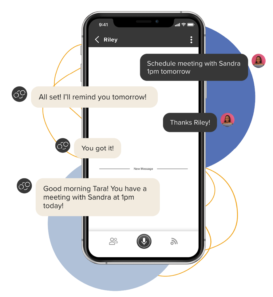
Feature Visuals
When designing the visuals to accompany the Feature’s copy and icons, I referenced the usability test insights to direct the process and make sure the images serve as an aid. I also designed the images to work independently of the copy. That way they could be utilized for social media, and other marketing content. After a few iterations from the Design Lead and stakeholders the final designs were agreed upon.
Tap and Go Voice Activation

Followup Reminders
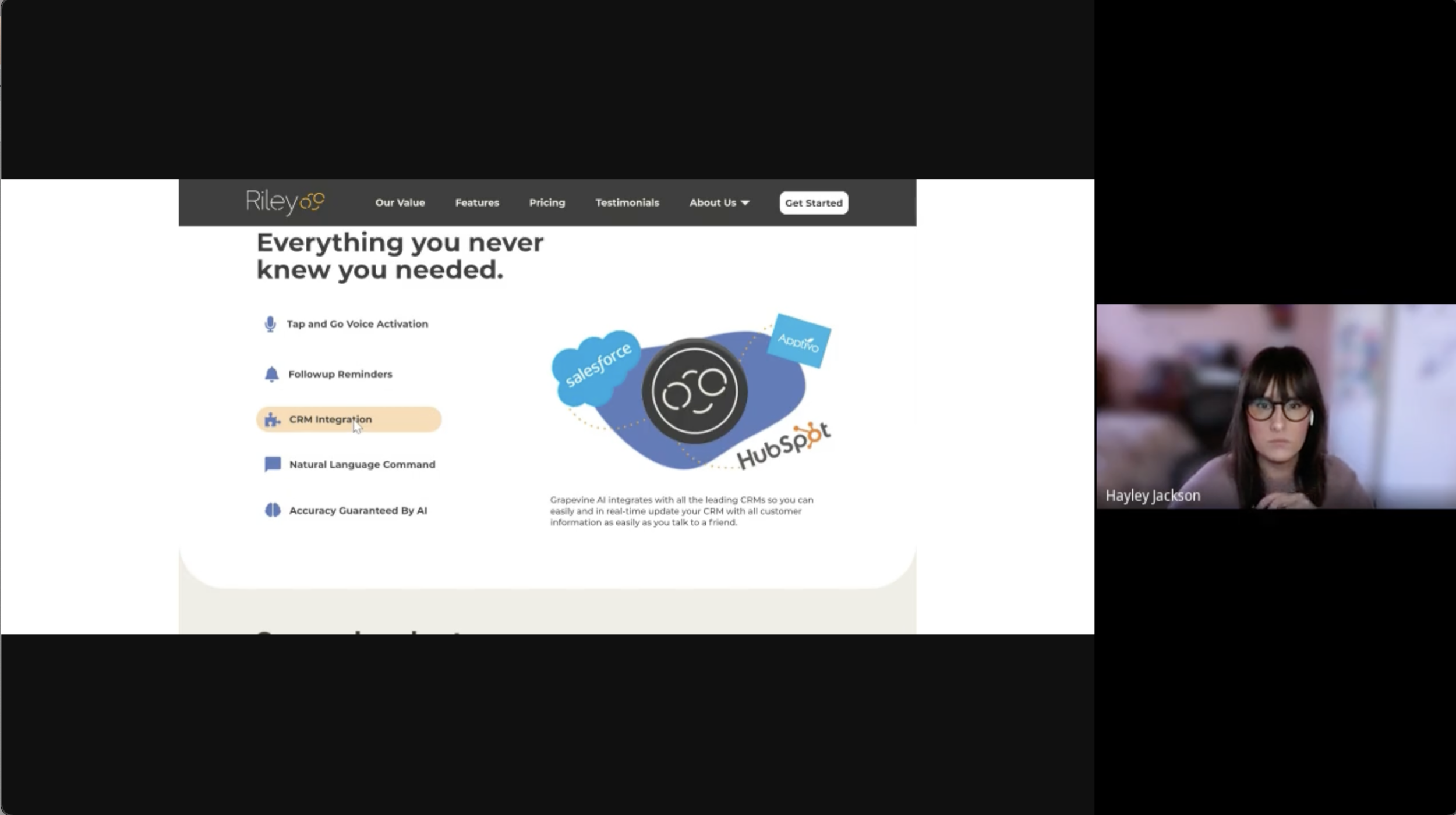
CRM Integration

Natural Language Commands

Accuracy Guaranteed by AI

Product Design
After the digital assets were created for the responsive website, it was time to delve into product design. This part of the project included reskinning existing Grapevine AI product wireframes, lighting demos for pricing flows, onboarding best practices, Day One Value, interaction design assets, and prototyping. After finalizing the product, the Riley mobile app was ready for beta testing.
Get Started Flow
To gain inspiration and insight into how other companies begin the onboarding process, I did a lightning demo of a few SAAS companies. We wanted to create a seamless onboarding experience that was familiar, informative and effective.
Mailchimp sign-up flow inspiration

Onboarding
Due to the young AI, the team and I had to design an onboarding process that explained the proper way to interact with the voice recognition software. We added a quick informative video along with in-app coaching texts to accomplish specific goals. The natural language commands make onboarding accessible and motivate the user to connect to LinkedIn and add other needed information organically.

Interactive Design
Preloader
The ideation behind the preloader design was to incorporate the Riley circles and to add an organic radial animation. The radial wipe is a familiar transition and the CEO felt it worked cohesively with the branding. The preloader was used to inform users of syncing, loading, along with other functions that require a wait time within the application.


Day One Value Screens
We created a flow that would take the user from onboarding into direct use of the product. The flow coaches the user to watch the informational video, sync their calendar, and LinkedIn, and prompt to create or complete a contact’s profile.

Calendar Connected

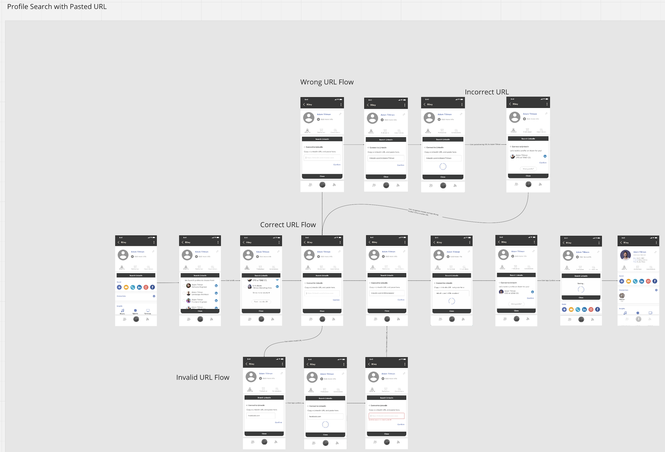
Profile Search

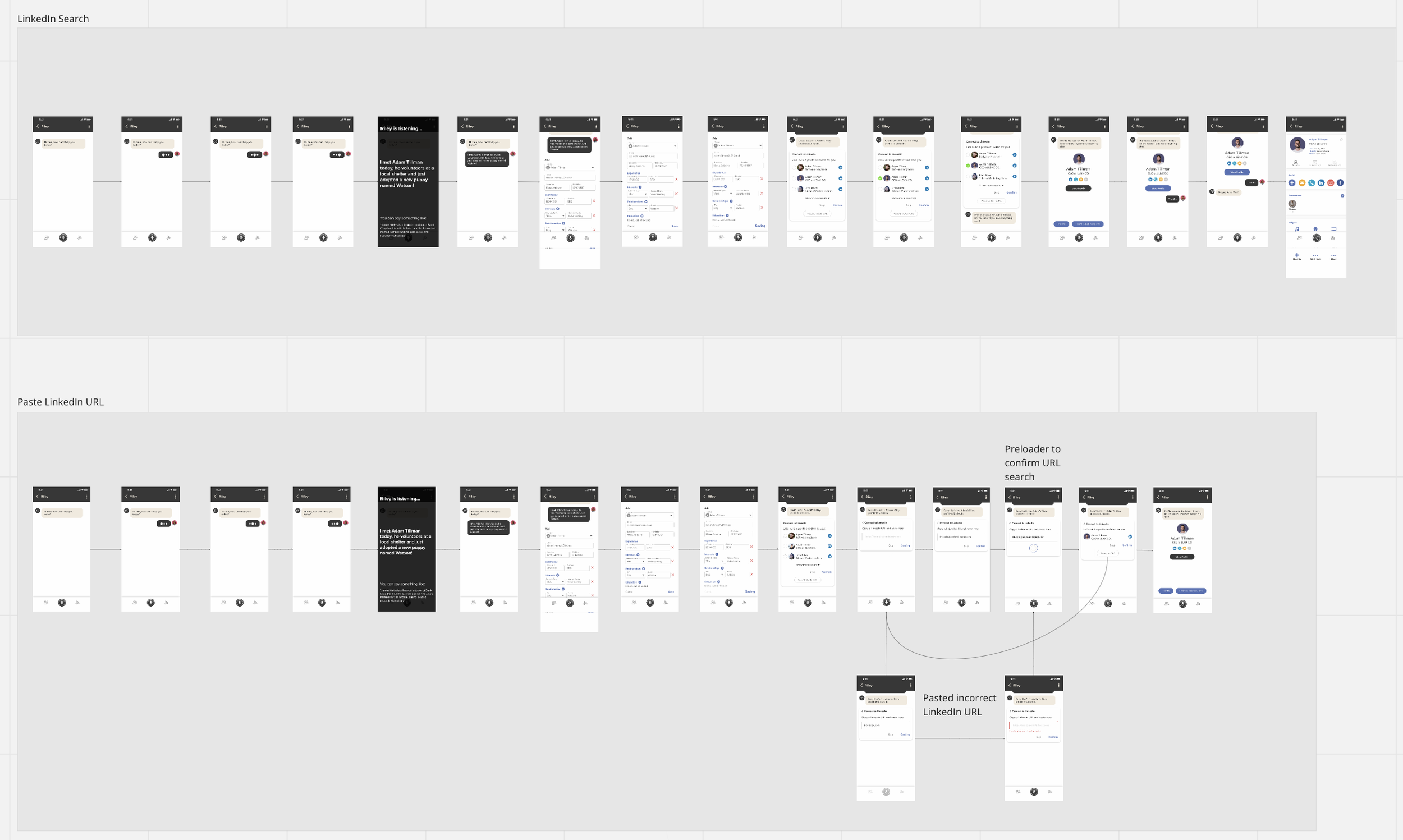
LinkedIn Search
This flow was created for users to search for a contact’s LinkedIn via a name or URL. The flow allows the user multiple ways to find a contact on LinkedIn and the errors or friction they may experience.
Prototyping
We created an interactive prototype to release to the Dev team along with detailed content to easily navigate the flows. This step aided in the development of the application for beta testing and along with continued open communication to explain design details to the engineers. The Riley application is currently undergoing beta testing, but will be available in the App Store soon.

Final Design & Reflection

Reflection
I am very proud to have worked with the Riley team during this pivotal transition, and my impact on the design process. It is empowering to help users nurture and cultivate their professional relationships. This project taught me so much, including:
Takeaways
Flexibility is key. Jumping into an active project, and the time constraint was initially a challenge, however, I managed to iterate and sketch efficiently through rapid prototyping and design sprint practices.
Communicate design ideas frequently and efficiently to the team. Working with a remote team based across the world called for open communication and aligned goals. Communicating any changes, blocks, etc in the process was to be shared advantageously.
Receive honest, constructive feedback during weekly meetings with stakeholders. Together our team discussed our decision-making process, refined our prototypes, and explored new ideas.
Further Development
Without the contract time constraint, I would have had more time to work with the product and help the Design Lead with arising UX issues.
Analyze data from Beta Testing. My contract ended with sending the product into testing. If time would have allowed, I would have analyzed the data from the testing with the design lead and ideated solutions.
Aid in the development of the Riley Design System. A design system from Grapevine.AI was in place but needed to be updated and aligned with the new UI and branding initiatives.
